Basics of UI UX
- May 2, 2023
- 7 min read
INTRODUCTION-
As we become more reliant on machines and software in our day-to-day lives, usability and accessibility have become really important. This is where UX and UI come into play.
In order design any interface it is really important to understand its users, the problems they face, the things they find interesting etc.

Learning Outcome:
Demonstrate the ability to critically comment on the interface of context and design. (Context 2)
Demonstrate detailed knowledge of the design tools to inform design thinking and processes. (Process 2)
Demonstrate knowledge of material characteristics and technologies to realize design outcomes. (Design realization 2)
Professionalize their networking activities. (Personal & Professional development 2)
WHAT IS USER EXPERIENCE?-
"User experience encompasses all aspects of the end user's interaction with the company, its services, and its products."
UX involves a lot of that and more in terms of creating an experience that encompasses the process from where the user even starts thinking about your service and it doesn't stop till the user has finished it.

Whole user experience design process breakdown into five main elements.
The five elements (in order of abstract to concrete) consist of
Strategy
Scope
Structure
Skeleton,
Surface


ASSIGNMENT 1 -
Lock Screen Study
What- Studied 4 lock screens and compared my own with others.
How-
By comparing different similarities and difference amongst them like notifictation panel, icons.
Placement of these elements and how they are different or same on other screens.
Size of elements. Is the date small on one screen and larger on the other?
Is the screen cluttered or does it have minimal information
Background images if any , how many screens have it and how many don't.


Analysed all lock screens, made user personas of each to understand why certain lock screens were the way they were, what the user was thinking or wanted.
After Analysing all the lock screens and users seperately, i then felt the need to compare the similarities and differences of each to figure out what works best and what does'nt for different users.
While interviewing, in order to get the user persona. I also got a better idea of what majority's preferences were-
For example, I learnt that people preferred their time, month, date and day to be centrally aligned.
These insights were useful especially while creating iterations in the next step.

Compared all the icons in terms of their size, color and placement.
Saw different text placements of time day and date and their stroke weights.

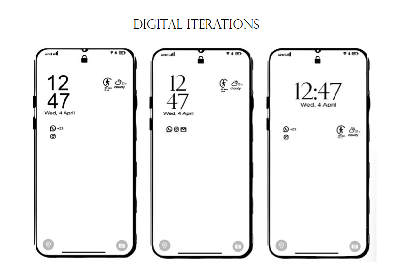
Drew 5 handsketched sketches after analysing the users and lockscreens, tested those with different users and wrote their feebacks, after analysing their feedbacks and views made digital iterations.
USER INTERFACE-
A user interface is the point of interaction between the user and a digital device or product like the touchscreen on your smartphone, or the touchpad you use to select what kind of coffee you want from the coffee machine.
In relation to websites and apps, UI design considers the look, feel, and interactivity of the product. It’s all about making sure that the user interface of a product is as intuitive as possible, and that means carefully considering each and every visual, interactive element the user might encounter.

Annotating & Analysing the Final Mockups-

Learnings & Refections-
Got to know about a person’s behavior and thinking by just looking at their lock screens.
Learnt how very minute little things also impacts the psyche of a person.
Correct Alignment, position, text, font weight etc. can be different for different people.
This assignment was not about redesigning, it was about studying the users, and making minute changes into what was already existing by researching and testing simultaneously.
Questioning the why and what behind every icon, alignment, etc. helped in analyzing the thought process of the users better.
It was a bit challenging to keep my own assumptions and what I personally liked aside and focus on what the majority people preferred or what made sense.
ASSIGNMENT-2
Decoding and Redesigning mobile applications-
Objective: Is to to understand how different layers of information and usability is designed
Task: Choose one mobile application to deconstruct, and after learning about the application, redesign the same with some new perspective.
CHOSEN APP- NETFLIX
Why i chose netflix?-
Netflix is one of the most used online streaming platform, with the most basic yet interesting interface and design.
First I studied and analysed NETFLIX as a brand to get a better clarity of why is the app designed the way it is.
Chose one taskflow to redesign-
SWIPE RIGHT-
Screen by screen Analysis-
LO-FI PROTOTYPES-
MID-FI PROTOTYPES-
SWIPE RIGHT-
HI-FI PROTOTYPES-
Learnings & Realisations-
One needs to look at the minute details to come up with redesigned version.
One needs to be Well versed with the app so that One can understand the layouting and framing.
Some frames didn’t have much to change in the user experience part, but I could improve the UI part in mostly all of them by minimizing a lot of unnecessary details.
It was really fun doing the redesigning of Netflix as it is one of my most used app and mostly all of the other users I spoke to connected to Netflix as an app a lot.
I learnt that in UI/UX it is necessary to first identify a problem and then start working towards different ways of solving that problem, by doing a proper research and user study by talking to different types of people.
FINAL BRIEF- Designing an APP for college-
(Group work _ Parri Ahuja, Gaurvi Napgal, Bhavika Gupta, Astha Mehta, Vrinda Gupta)
Brief:
Create an application that covers any aspect in an educational institution.
Also create a working prototype for the same
Initial Research-
Questionnaire
Pain points
Comparative Competitors Analysis
Personas
MoSCoW
User stories
Questionnaire-
Beginning with the questionnaire and talking to different students from different departments gave us an idea about what the students on campus thought about the college stationery,what were their views, what they experienced, asking them different kinds of questions gave us a direction on where to focus, what were the pain points and gave us a direction to move forward in.
Figured out the pain points by visiting the college stationery and talking to students that were present their.

Pain Points-

Its necessary to first identify the problem before you start working towards its solution.
Comparative Analysis of existing Stationery brands-


Doing a comparative analysis gave us an idea of what works or not, what were the common elements and how stationery apps works.
What were the different types of features etc.
Some apps were too chaotic and looked disorganised while most of them had a clean background and simple layout.
Personas-

User Persona helped us understand our users' needs, experiences, behaviors and goals.
Creating personas can help you step out of yourself. It can help you recognize that different people have different needs and expectations, and it can also help you identify with the user you're designing for.
User Stories-
User stories are short statements about a feature, written from a user's perspective.

The user story provided the us with important context on what the end-user's goals are. As a result, this informed the functionality of our app and helped us establish the order and the way our features are designed.
LOGO & Naming-
We then came up with different names for our stationery app, we wanted to keep it short and crisp so we decided to go with STAPLES.

Why Staples?
a piece of thin wire that is driven through papers and bent over at the ends to fasten them together or driven through thin material to fasten it to something else
Also, just like staple food is consumed on a daily basissimilar stationery is something that we designers use and purchase on a daily basis.


Color Palette & Typography-

Why this color palette?
Since we wanted to keep it simple and basic we mainly used white and black, red was used in logo, icons and to add a pop of color wherever needed, also since we were creating the app for our college, we had iiad logo in my mind, which is also red and white.

Why Inter-
Like most sans serif typefaces, Inter is a workhorse. Whether used at large or small sizes, Inter maintains great readability. This is thanks to its tall x-height. Not only does this make it easier to differentiate between upper and lowercase letters, but it also helps to create space between lines of text.
USP-

MOSCOW-
Must have, should have, could have , would have

It’s a prioritisation technique which is easy to learn and simple to apply. It can also help you decide what’s really valuable for your UX projects before you get started on them.

After a thorough research We came up with Unique features that no other app waas offering and that made sense in terms off our college usage and the users.-
Research Display Board

Sketching ideas for wireframes-
LO-FI PROTOTYPES-
Then we sketched all the lo-fi wire frames on paper and labelled them, they acted as a layout for creating our mid-fi prototypes, though a lot changes were made in the digital ones but still the lo-fi versions were helpful in terms of getting an initial idea.
MID-FI PROTOTYPES-
After completing the low fi wireframes, we took faculty feedback and the faculty advised us to move ahead and make mid fi wireframes.
While making the mid fi wireframes, following points had to be kept in mind :
Naming of wireframes
Proper proportions of each and every element
Spacing and outer padding
Enough breathing space
Accurate labelling of elements
Sizing of icons and visuals
HI-FI PROTOTYPES-
When we completed the above wireframes, faculty gave us a heads up to not waste more and start the UI as soon as possible. There were still some gaps which we had to rectify, but we thought that we can cover the same while doing UI.

Home page-
Kept it very simple, to the point and user friendly, It has the logo at the top left, cart on the top right corner,
then we have the search panel and product scanner, to scan similar products
Then we hsve kept an offer panel to make it more appealing and interactive
Then we have department vise categories for particualr requirements, must haves and the bottom panel that has the home page, notification, wishlist and user profile.
FINAL PROTOTYPING-
Learnings and Reflections-
Find a user’s true desire by what they do, not just what they say.
To some extent, forget about your past experience, beliefs or what you personally feel or think and focus on the users perspective.
Talking to people, asking them questions, in short user interaction was something that was very a crucial aspect of this project and helped.


Comments