Website Designing UX UI Project
- Dec 11, 2023
- 3 min read
As we become more reliant on machines and software in our day-to-day lives, usability and accessibility have become really important. This is where UX and UI come into play.

Before dwelling into a client brief I first anaylsed a website in order to get a basic clarity on how a website is designed and structured.
Analysing this website gave me an insight on how a well designed website should look like in terms of the navigation bar, footer or the basic layouting and use of text and images.

CLIENT AND BRIEF
The aim of this project was to create a dynamic and user-friendly website for the Commerce Society of Kirori mal College, Delhi University named COMSOC to provide an online platform that effectively showcases and facilitates the society's activities, events, and communication with its members and the broader college community.
President: Commerce society Kirori mal college

The client also shared a reference website with us to begin with-
Here is the link to it -https://marksocsrcc.in/
We understood the basic requirements and needs of our client in detail, on google meet and through various calls and this is what we gathered-

After understanding the clients goals and his vision we gathered a few keywords and then started our in depth research on that-
It was extremely essential to know about these things, where the client told us about how actively their society is working and also the challenges they are facing without the website.
Questionnaire
The initiall step involved a questionnaire analysis wherein we got the responses of all the society members and analysed them to carry forward our intiall research.
We as a group discussed and formed a problem statement, of whatever we could gather from our client, and then furher studied the project background and made a to do list of what needs to be done further in our research.
Competitive Analysis-
Conducting a competitive analysis before the initiation of the website project was a crucial step in understanding the client's position within their industry.
Journal Research notes-
personal
After doing all the in depth research we also started building a branding board, on how we want the look and feel of our website to be.
BRAND BOARD

Moodboard
We wanted the website to be very interactive, having interesting animations as its a student based website and our client wanted it to be fun and interactive yet have a professional touch to it. So we decided to keep the background black as shared by the client in the reference.
Within our MOODBOARD, we incorporated the colour scheme, the typography, the animations, user interface and flow, various interactions etc. which we wanted in our website as well.

Sitemaping-
A sitemap is a visual or hierarchical representation of a website's structure, outlining the arrangement of pages and their interconnections.
After carry forwading this in depth research and analysis we divided the work between all the 4 members in terms of screens, that who will design which screen

PAGES DESIGNED BY ME-
Homepage
Our Team
Publications
Recruitement
Registration form
Notification Page
Icons
INITIAL SKETCHES- LO-FI Wireframes (individual)
OUR TEAM-
For our team I wanted a bit interactive and fun UI since its a team collaborative website,
its all about collaboration and teamwork of members, so I decided to add hand illustrated doodles.
They had a team of 80 students, so the client suggested to only add pictures and doodles for the core team memebers and rest all to be in the nornal list view.

Reference board-

Group Lofi sketches-
MID-FI WIREFARMES-


ILLUSTRATED PICTURES-
hand illustrated

FINAL UI-
HOMEPAGE-
Lofi sketches (Individual)
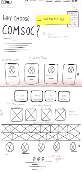
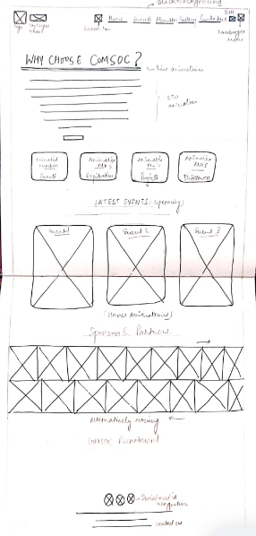
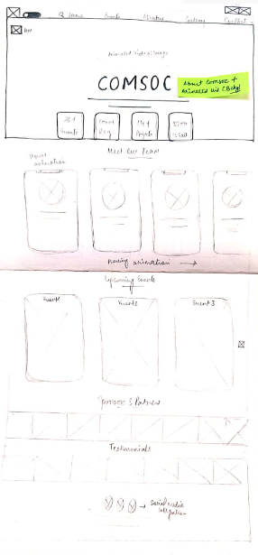
For homepage we all decided to make the initial lo-fi sketches, since it is the main page,
Then based on the sketches we decided what all to take and include from each iteration , and made one mid-fi wireframe based on that.
Mid-fi and High fi wireframes-


RECRUITMENT & REGISTRATION PROCEDURE PAGE-


PUBLICATION PAGE-


Other mid-fi and high-fi frames-
Other high-fi Wireframes ui
ICONS-
PROTOTYPING-
Project Learnings-
I learnt a lot through this project about the coordination between a client,a designer and the developer.
It was important to be in touch with client at every step, in order to understand what exactly he wants, and what is working out for him and what is not.
Things such as creating a mood board for the client, providing comparative analysis, communicating the elements of MOSCOW, etc. are the key features to design a website.
Iterations are a must in any design process, but I feel UI/UX demands more number of iterations at each step from lo-fi, mid-fi to high-fi wireframes which results in a more thoughtful outcome.


Comments