Illustrated Vector Map
- Sep 4, 2021
- 5 min read
Updated: Mar 21, 2022
“Home is not a place…it’s a feeling.”
Rejected hand drawn maps-I was not satisfied with both of these maps as I found them to be too simple and childish.


FINAL hand drawn map- I was satisfied with my third attempt as this is what I had imagined it to be like and this will look better as an illustrated vector map

INTRODUCTION-
-This is the hand drawn map of my colony where I have been living for almost nine years. Making this map brought up a lot of childhood memories. This is the place I call home and where I feel the safest and the most comfortable, I am familiar with each and every corner of this place and this is the reason why I chose this area.
-I was a bit confused about how to go about it because honestly I have never really drawn a map before, but in my childhood I used to play treasure hunt a lot and we used to make maps, so I got the idea from there and made something similar to what I used to make.
THE VIBE OF THIS PLACE-
-It is a very peaceful and a calm place.
For me, this place has a very homely vibe, I feel safe and comfortable in the surroundings.
-I have kept my own separate names for different lanes and shops and I intend to add them in my final map also I have a lot of childhood memories associated to each area, I am thinking to depict them through some icons or a writing a few words, for the homely vibe I am going to add an aesthetic touch by using soft pastel colors.
STRUGGLES IN DIGITAL LINE DRAWING-

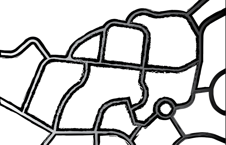
-I had made a digital colored outline for my map, it had a lot of technical errors as I was still struggling to learn even the basic tools. After seeing my outcome I decided to change the layout of my map, I now wanted to try and make a map with only curved roads.
I also thought of adding the color later and just focus on the line drawing for now to get a clear picture for my map.
FINAL DIGITAL LINE DRAWING-

SHORT REFLECTION-
-I had to struggle a lot while making this digital outline as I have never used illustrator before, I was finding it very difficult to even use the basic tools like pen tool, eraser tool etc. Curving the lanes was the most annoying task. First I used the curvature tool for making the curved roads but that didn't work for me, then I used the pen tool to draw and direct selection tool to curve each point. Even the shape builder tool was difficult to use at first but then I learnt it from my classmates.
-I learnt that no matter how much you see or hear, you will only be able to succeed at it if you practice it by yourself.
ICON EXPLORATIONS-
slideshow
For the tree icons, I tried to add tonal variations in the color to give it a realistic touch, I added dark and light tones of green to depict that, using the shape builder tool.
For the houses, I didn't use the colors that are really there in my locality, but I used soft pastel colors to add that homely and safe vibe.
I haven't really experimented with textures right now as I am facing a little trouble doing that, I'll learn how to add textures and then explore more.
Selecting colors according to a vibe is a bit tricky, but I am trying to figure it out by trying different shades of different colors.
ADDING COLOR AND TEXTURE TO THE ROADS-
slideshow-
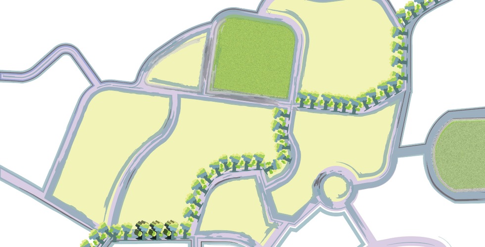
I had to try different textures for my roads in order to add the realistic touch. Each texture is adding its own uniqueness to the map, and it's becoming difficult for me to choose my final one.
FINAL SELECTION-

Finally I decided to choose this watercolor texture for my roads as it is adding the aesthetic touch as well as a subtle look. I wanted the roads to be of a subtle texture because my icons are very colorful and a bit complex, so I wanted to balance out the whole look and avoid any kind of chaos.
COLOR SCHEME SWATCHES-

I have decided to keep my color palette very subtle to add the aesthetic vibe, so that is why I have chosen soft pastel color tones for my map and icons.
I am facing a difficulty in selecting maximum 5-6 colors as I wish to make my map colorful and bright to add the liveliness.
I have studied the difference between RGB and CMYK and have also noted their values in my color swatches.

-Sometimes things don't turn out the way we expected them to be, but it's fun to explore everything and then figure out the final outcome along the way.
ADDING THESE COLORS TO MY MAP AND ICONS-
SLIDESHOW-
At first I was really confused about which color should be added where, then I tried adding different colors to different areas.
I also realized that my map, icons and the color palette looked better individually, but when I combined all of it together, it didn't turn out to be that good.
“It’s pretty confusing.”
“Good. Be confused. Confusion is where inspiration comes from.”
― Robyn Mundell, Brainwalker
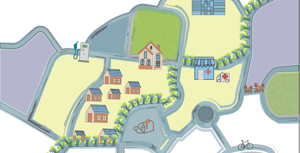
To depict the main area used the teel blue shade, used yellow and brown color in the background to add the soft, subtle vibe. The soft pastel colors that I used, the road texture and the depiction of various icons helped me achieve the aesthetic look that I wanted for my walk.
FINAL OUTCOME-

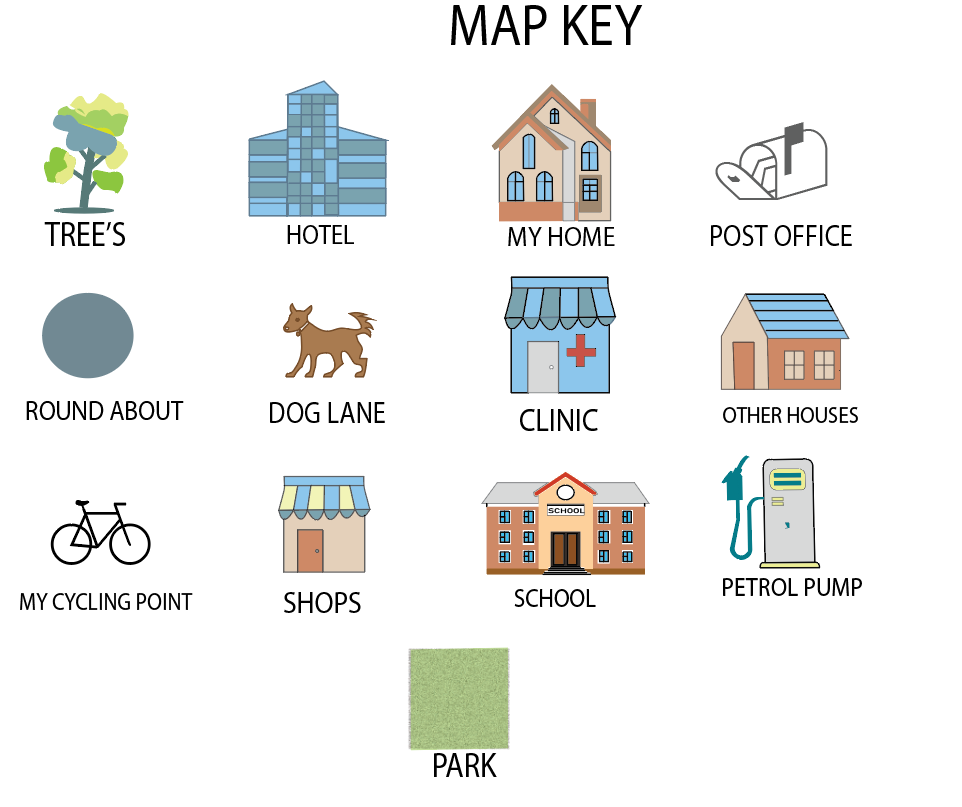
MAP KEY-

-I have named my final map as SERENITY as it gives a really calm and peaceful vibe. And I think I did pretty well as I was totally new with the illustrator and was even finding it difficult to use the basic pen tool at first.
When you practice, you get better. It’s very simple.
You must have a level of discontent to feel the urge to want to grow.”
IMPROVING FURTHER- Making changes according to the feedback
SLIDESHOW-
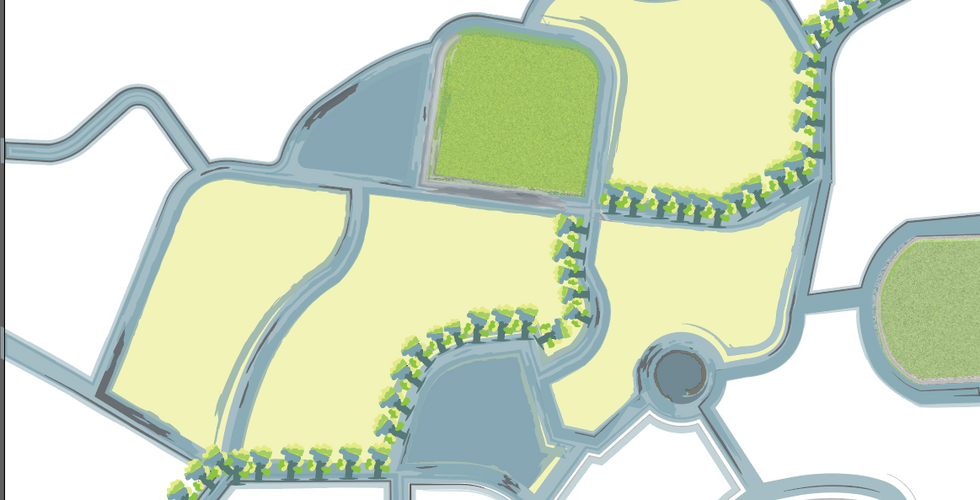
I decided to change the color scheme of my map and the icons according to the peaceful and aesthetic vibe, I thought that the previous color scheme had way too many colors and also the color of the icons was not blending or matching with the map.
Also in my previous map I had added the gradient effect on a few places that was not going well with the overall look of my map.
I also decided to add text in my map on important places as I wanted to add a personal and familiar touch.
Also I have left the green blocks empty in order to give some breathing space to my map.
FINAL OUTCOME-











Comments