
Tools of Design
- Oct 26, 2022
- 5 min read
PROJECT DOCUMENTATION & REFELCTIVE VLOG
INTRODUCTION
The primary objective of this project was to introduce us to skills and methods used in the development of design concepts coupled with the formal skills relevant to effective contemporary communication design practice through designing a travel poster of a city using different design techniques and tools.
LEARNING OUTCOMES
Interpret the manifold nature of contexts (literal and figurative) (Context 1)
Demonstrate design as forms of meaning-making and negotiation. (Process 1)
Identify and apply given tools of making and their impact on design realization. (Design Realization 1)
Recognize the context of their own position as designers situated within the contexts of practice. (Personal & Professional Development 1)
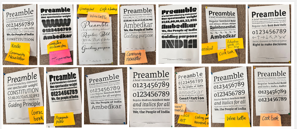
1-Expressive Type-


KEY WORDS AND ATTRIBUTES-


RESEARCH-


Visual References -


These were the 5 attributes that I chose as they were perfect for the Goa vibe and I felt that I would be able to express them using type. (Helvetica)
Why were we told to use only Helvetica as a typeface in our expressive type and poster?

I felt Helvetica as a typeface is very simple yet classy,
and it almost went with everything, also at this beginning stage we were supposed to focus more on the spacing, layout, sensitivity about the distance between the letters, and how to manipulate them to express the meaning of the word and not focus much on the choice of the typeface.
Example from my work-

Learning and Realisation-
A good typeface is always legible, clear and straight forward.
A typeface must not always be expressive, like for example if we have to write the word dog, It doesn't necessarily have to bark at you, the word dog itself gives a clear picture of a four legged barking animal.
We can keep it simple yet clever, it doesn't always have to be literally expressive.
Balance and spacing matters a lot.
FUNDAMENTALS OF TYPE-


2-Type as Image-


Inspiration mood board-
source- Pinterest

Digital Iterations and Thumbnails-

Final Type Posters-

I like the first one because of the color and the architectural motifs in the background, which was inspired by the houses in Goa.
The second poster seemed very well balanced to me and the visual anchor here is the date, which is getting the most attention, I also tried to include the color as well as the architectural motifs here also.
The third one is interesting because of how the the word Konkani is forming a boat.
Learning and Realisations-
An overall visual balance in a design poster is really important, also hierarchy plays an import role as it dictates the eye movement of the viewer.
The words type as image itself explains that how type itself is a very strong tool in designing,
We can communicate so much by just using type. By trying out different variations in terms boldness, fonts etc. Type itself can act as an image if we manipulate it well!
3-Graphic Designer Research-

Link to the presentation-Graphic Designer Presentation.pptx

Learning and Realisation-
Each designer had his/her own unique sense of style.
They tried to bring their beliefs and express themselves a bit through their work.
They changed their perceptions and ideas according to what the world demanded at that time.
They evolved with time and this could be seen in their work.
ADDITION-SUBTRACTION-JUXTAPOSITION-


Examples/Inspirations
source-Pinterest

Learnings & Realisation-
Addition- adds value to a message, its simple yet meaningful.
Subtraction- Ambiguity
Juxtaposition-The proximity of one thing to another creates meaning. It gives the pleasure of decoding
POST CARDS-
Inspiration mood board-

I decided on to go for the beachy goa vibe for my postcards as Goa to me always reminds me off palm trees, beaches, peace and serenity.
Digital Iterations-

I tried to employ all addition ,subtraction and juxtaposition, but I felt addition was simpler yet affective. In subtraction I tried to replace elements, for e.g. replacing the G of goa with the Coconut and adding a straw.
Final Postcards-


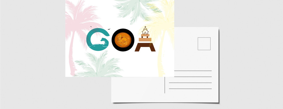
One of my fond memories of Goa was of eating goan fish curry, that my mom even makes at home now. So I even tried to include that element in one of my postcard.
COLOR STUDY-

Presentation Link-Color analysis.pptx

Learnings & Realisations-
Color represents emotions and change.
It acts as a symbol, as the main hero.
Shows the transition throughout the movie.
Sets up the overall mood.
Acts almost as a character in the movie.
A color can truly shape and change the character, in terms of the overall mood and their personality.
Color of clothing in the movies of the characters tells a lot about their mood and personality.
Color Palette Created for Goa-

VISUAL PUN-

Puns for my city-

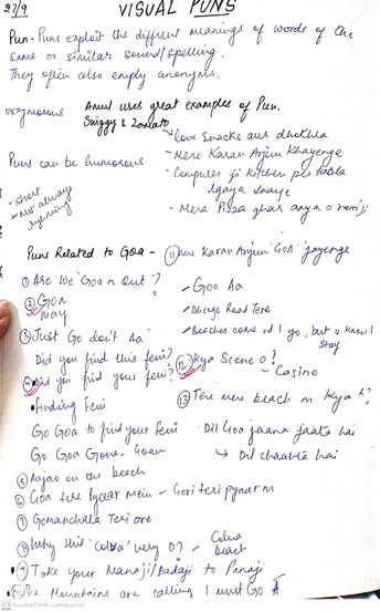


Inspiration mood board-
source- Pinterest and self clicked pictures-

DIGITAL ITERATIONS-

I went for a simpler approach in this as the examples I saw on billboards were very simple, minimalistic but the puns were clever and witty. Also I feel billboards should be simple as a large number people read them and everybody should be able understand what's happening.
FINAL PUNS-

Learnings & Realisations-
Billboards should have a balance between the text and illustration/image in order to grab the attention of the audience,
Puns should not be too obvious nor too difficult to understand.
Brands, marketers, and advertisers use visual puns to speak to all of society, but especially to specific demographics.
I feel adding puns to billboards make the advertisings more witty and clever, it adds humor and the impact of it stays with the viewers for a longer time, it helps to remember the brand even better.
It was fun creating our own puns according to our city, it helped me research more about my city in terms of its language, food, movies shot their etc. For example the movie finding fanny was shot in Goa and Feni is a famous Goan drink, so the pun "Did you find your Feni?" makes a lot of sense yet it is not too obvious.
TRANSFORMATION-

IDEA- The ideas was to depict that how goa beaches were clean, full of sea creatures and non crowded, then how slowly and gradually they became crowded, polluted, sea creatures started dying, then how covid affected the situation and now again everything is back to normal.
Across 2 frames-

Across 3 frames-

Across 5 frames-

Final Poster-
Location for the final poster- Parra Road, Mapusa Village GOA

I decided to go specific in terms of location as I had researched about Goa as whole a lot in terms its history, architecture, traditions, culture etc and in order to show uniqueness in my poster I decided to choose a location that i felt was interesting and I personally felt connected to.
Research-


Travel Posters I looked at for inspiration-


IDEAS-


I used elements of watermelon in my poster as Mapusa village is known for growing Lucious watermelons,
I used the element of cycle inspired from my favorite movie Dear zindagi that was shot on that road on a cycle.
My favorite memory of this place was its serene vibe and the sunset i saw there,so I added sun.


Learnings and Realisations-
It was important to look at different posters for style references and to look at what I found interesting and to figure out what style do I want for my poster.
Research was one thing that helped me alot in terms of finding the right elements.
Techniques that we learnt like addition,subtraction and juxtaposition helped me bring the key elements together as one composition.
Type of course was the most helpful tool, looking at different typefaces and figuring out which one went well with the whole vibe of the city and also balanced the overall composition of the poster.
Color almost played as the main character as it added the pop up element in the poster, I used bright colorful colors inspired by the colorful houses we see in Goa.


Comments